Understanding a protocol’s fee structure and revenue model is essential to understanding DeFi as a whole, and DefiLlama’s “Fees and Revenue” dashboard is a great place to start.
Just like with traditional financial services, DeFi protocols charge users fees for their use.
Fees charged on individual actions, like swapping tokens, are usually small.
For example, top decentralised exchange Uniswap charges a 0.3% fee on swaps, paid to liquidity providers who deposit their crypto into the protocol to facilitate trades.
But with enough trading volume, these small fees can add up fast.
Over the past year, the Uniswap protocol generated a whopping $542 million through fees alone.
For many protocols — like Uniswap — fees are paid entirely to liquidity providers.
Others take a portion of the money generated and direct it to the protocol’s treasury.

On DefiLlama, a protocol’s total fees minus the portion paid to liquidity providers is its revenue.
Revenue is used at the discretion of the individual protocol.
Common uses include funding protocol development, saving the funds for a rainy day in protocol treasuries, or providing rewards to incentivise people to use the protocol.
One popular way DeFi protocols distribute revenues is through governance tokens that investors must lock up to earn rewards.
This method has worked well for decentralised exchange Curve Finance and its governance community, who have locked up over $3 billion worth of the protocol’s CRV token.
Investors who lock CRV can vote on which liquidity pools receive half of the fees generated by the protocol, as well as all future CRV token emissions.
Not all DeFi protocols create revenues. Of the thousands of different projects operating on blockchain today, most struggle to retain a sustainable revenue.
Tracking Fees and Revenue
DefiLlama’s “Fees/Revenue” dashboard tracks the fees and revenue for hundreds of protocols across more than a dozen major blockchains.
The data is split between two sub-dashboards: Simple and Advanced.
Let’s take a look at the “Simple” dashboard first.
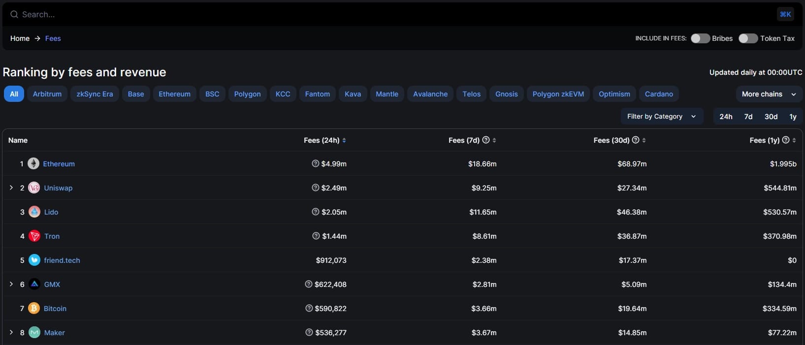
This dashboard only focuses on the amount protocols generate from fees over the daily, weekly, monthly, and yearly timeframes.
At the top users can search for a specific protocol.
They can also toggle the data to include bribes paid by other protocols in the fees calculation, which is relevant to certain protocols such as Convex Finance.
Despite the name, the term “bribes” in this context does not refer to anything criminal or dishonest, but a common DeFi praxis.
Token bribes are paid to meta governance protocols, like Convex. In return, Convex uses governance tokens it holds, such as CRV, to direct rewards to a Curve liquidity pool of the briber’s choosing.
Bribes are a cost-effective way for new protocols to attract liquidity to their token’s trading pool on Curve.
A final toggle for token tax applies to protocols which charge users a tax on successful transactions, such as trading bots like Maestro.
Users can filter the data by specific blockchains, and the type of protocol, such as decentralised exchanges or lending protocols.
Sometimes a broad overview isn’t enough to get a clear picture of a project’s success.
For more granular data, each protocol has its own page that includes a complete timeline of fees and revenue.
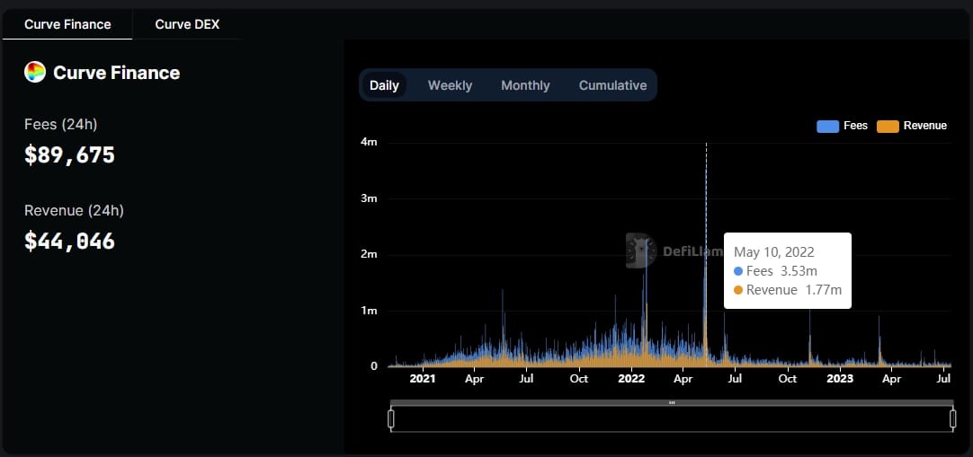
When investigating Curve Finance’s fee and revenue history, we can see activity spiked between May 6 to 13, generating over $15 million in fees for Curve Finance.
The mystery of the May spike is solved by cross-referencing the data with that of Curve’s “Defi Overview” dashboard.
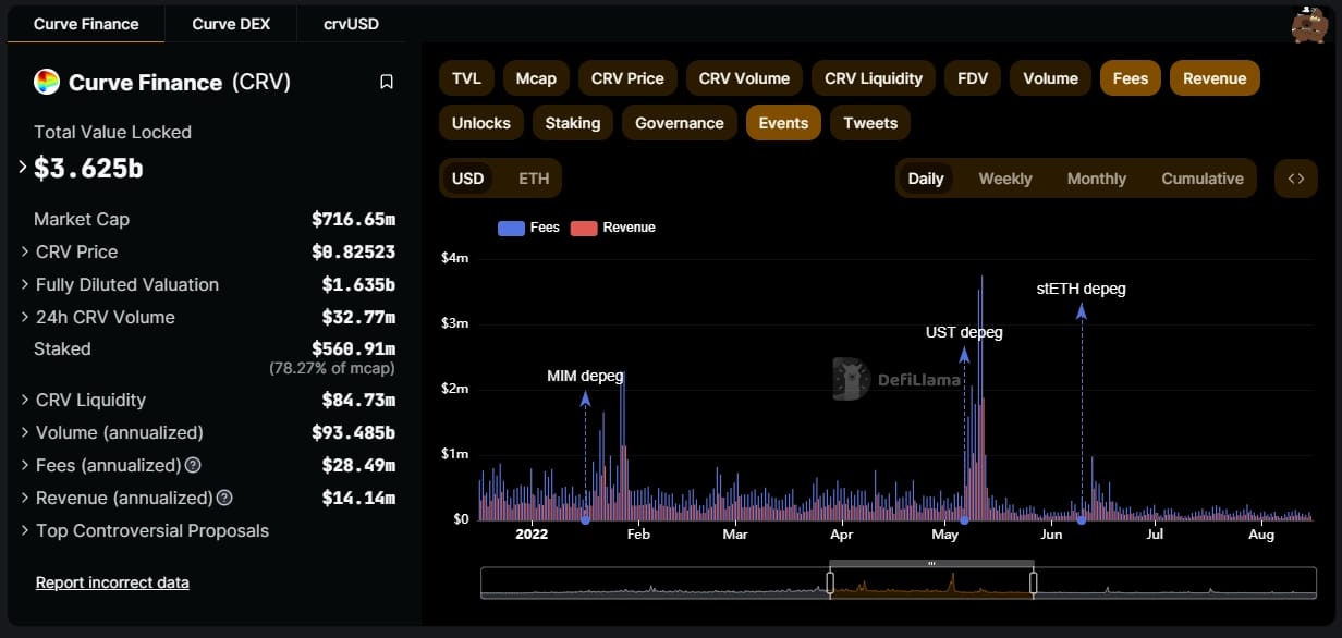
Here, we can see May 6 to 13 was the week the Terra blockchain’s stablecoin, TerraUSD, collapsed.
Curve Finance facilitated trading of TerraUSD, and once the stablecoin failed many traders rushed in to sell their holdings for other stablecoins.
That week, Curve made $7.5 million in revenue from transaction fees and swap fees. However, Curve’s total value locked fell by $9 billion due to TerraUSD falling from its dollar peg to mere fractions of a cent.

Next, let’s look at what additional data the “Advanced” dashboard yields.
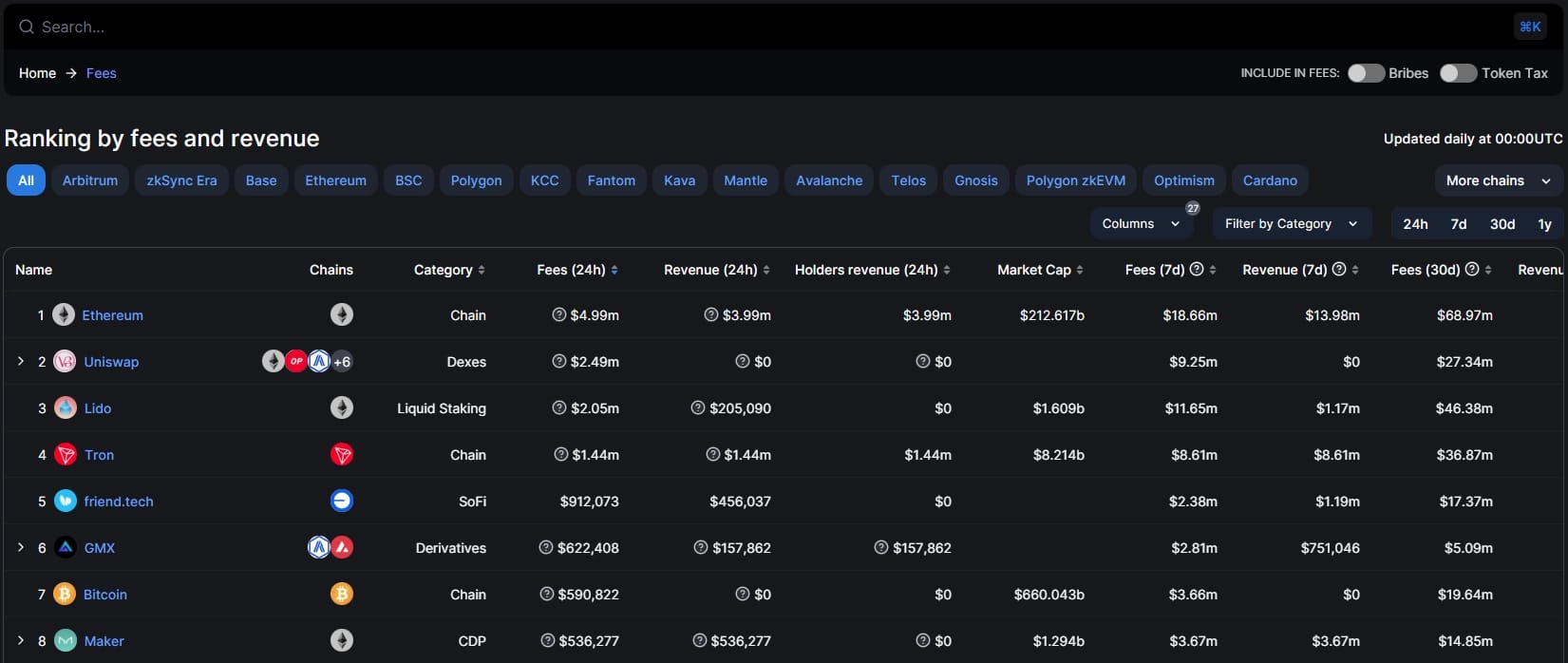
It looks similar, right? While the format and filtering options are the same, the amount of data provided is far greater.
By scrolling horizontally across the table, users can find data not only on protocol fees, but also total revenue, treasury revenue, supply side revenue, cumulative fees, incentives, net earnings, as well as helpful calculations for a given protocol’s price-fees and price-revenue ratios.
There are gaps in the data, but this is normal.
For example, a protocol may divert all its revenue to token holders and send none to its treasury, so its treasury revenue column is blank.
For the thousands of fly-by-night protocols that have met an early demise, there is a short list that has built profitable operations.
A well-planned fee schedule and the implementation of revenue-sharing incentives have helped cement a select few protocols as industry leaders.
Next steps
- Find out which DeFi market sectors tend to make the most revenue. Which sectors make the least?
- Discover which protocols have the largest treasuries in DefiLlama’s “Treasuries” dashboard.
